

Everything About E-Commerce Websites Developing Projects
It’s expected that online retail spending will spike during the holiday season, but did you know that 3rd quarter online retail spendingincreased by 13% in 2011? It’s fitting, then, that as we begin the 3rd quarter of 2012, we recap on e-commerce. Last summer, I wrote an article on ten things you should definitely know about e-commerce, and in the spirit of summer sequels, here’s part two.

Have you ever stopped to consider what makes an e-commerce website successful? Is it good planning? Investment? Good user interface design and consideration of usability? Security? I think it’s a combination of all of these things and more. Beginning with investment and working our way through checkout, I’d like to go through the essential issues that make good e-commerce possible. It’s going to take some time, though, so find comfortable spot and let’s get started, or feel free to hop around the topics as you see fit.
Investment
To do e-commerce well, you need to expect to make a significant investment — in time and money.
As far as time is concerned, a general principle that applies to just about any web development project is that it will probably take more time than you plan for. The more complex a project is, the more unforseens are likely to arise. While the exact timeline will depend upon many factors unique to you — the nature of your business, the size and complexity of your development project, the team you’ve assembled, etc. — I can tell you exactly how long e-commerce projects take for us. A typical website project without e-commerce will take 3-4 months from start to launch, assuming no delays or interruptions. But an e-commerce website project could take that entire time just to prototype. In fact, of the e-commerce projects we’ve worked on in the last year, the quickest prototyping phase was two months and the longest was just shy of four! But despite the range in the prototyping time, in the end, both of those projects took over a year to fully complete.
E-commerce is also expensive. But then, why shouldn’t it be? Aside from the additional operational costs that e-commerce requires, e-commerce development requires significantly more technical expertise to properly plan and implement than development of a typical website. More time + more people + more technical complexity and programming = more cost. But, anything that you expect to make money should be expected to take money, too.
Planning…for the Invisible Things
This is a warning, of sorts: I feel a moral obligation to begin this article with some of the fundamental financial, security, and legal matters that are unavoidable and necessary to doing business online. These are the invisible things that make e-commerce possible. They’re not exciting. They’re rife with detail. They’re boring. But you must be familiar with them. That being said, I’m only skimming the surface of these particular issues. Much more could (and should) be said about them — particularly their legal implications — but I am in no position to offer anything even resembling legal advice. I will repeat this later.
If this first section doesn’t contain the sort of info you thought you were getting when you clicked to read this article, fair enough. Go ahead and skip down to “Designing the Right Store.” But promise me you’ll bookmark and come back to this other stuff at some point, or at least look into it on your own. It’s important!

Merchant Accounts
Every business must have a merchant account. A merchant account is distinguished from a regular bank account by its ability to accept payments by credit and debit cards. But not all merchant accounts are configured for e-commerce. If your business is a new one, be sure that — before you do anything else — you confirm with your bank that your merchant account is qualified for internet transactions. Seems like a no-brainer, but I can’t tell you how many times I’ve seen a project halted at an embarrassingly late stage because this was never investigated beforehand.
Every business must have a merchant account. A merchant account is distinguished from a regular bank account by its ability to accept payments by credit and debit cards. But not all merchant accounts are configured for e-commerce. If your business is a new one, be sure that — before you do anything else — you confirm with your bank that your merchant account is qualified for internet transactions. Seems like a no-brainer, but I can’t tell you how many times I’ve seen a project halted at an embarrassingly late stage because this was never investigated beforehand.
Payment Gateways
A payment gateway serves as a financial intermediary between your customers and your website, taking care of approving credit card transactions and capturing funds without interrupting the user experience unique to your website. The same process that occurs in just seconds after a customer’s credit card is swiped at a point-of-sale terminal in any store — where transaction details are passed over to the merchant account payment processor, then to the credit card’s issuing bank for approval, then back to the merchant where the funds are requested — is handled by payment gateways in online store purchases. In other words, a payment gateway is like an invisible point-of-sale terminal (i.e. cash register).
A payment gateway serves as a financial intermediary between your customers and your website, taking care of approving credit card transactions and capturing funds without interrupting the user experience unique to your website. The same process that occurs in just seconds after a customer’s credit card is swiped at a point-of-sale terminal in any store — where transaction details are passed over to the merchant account payment processor, then to the credit card’s issuing bank for approval, then back to the merchant where the funds are requested — is handled by payment gateways in online store purchases. In other words, a payment gateway is like an invisible point-of-sale terminal (i.e. cash register).
The way I explained it last year is still how it works, so here it is, verbatim:
When users complete and submit payment forms on secure websites, the sensitive information they’ve included—specifically, their credit card type, number, CVC (card verification code) and expiration date—is encrypted (more on this later) and relayed to the payment gateway, which then approves (or denies) the transaction and captures the funds. This all happens in the blink of an eye, between when the user clicks “Submit” and then sees the screen confirming their purchase.
The Play-By-Play
- A user fills out a payment form on your website and hits “Submit.” Because the website is using SSL (secure socket layer)—its address should begin with https://—the user’s browser will encrypt this information before passing it over to your website.
- Your website then passes over the encrypted order to their payment gateway. The payment gateway then passes the order details to your merchant account’s payment processor.
- The user’s credit card issuing bank then receives an authorization request from your merchant account’s payment processor and will respond with acode either approving or declining the transaction, as well as indicating the reason for the decline (e.g. “the credit card number is invalid,” “the credit card has expired,” etc.).
- Your merchant account payment processor then relays this response to your payment gateway.
- The payment gateway receives the response and forwards it back to your website, which will process it and display the relevant message to the user (e.g. “Thank you for your purchase,” or “Your purchase could not be completed…”).
This entire process takes about two seconds.
Your payment gateway will have administrative tools that enable you to determine which payment methods you will allow (e.g. Visa, Mastercard, AmEx, Discover, PayPal, etc.) as well as how funds are captured. Whether transactions are pending until shipment occurs, batch-captured on a set schedule, or automatically at the time of sale are all configurable options. These variables are important to consider relative to your unique operation, but can also be changed fairly easily. You just don’t want to launch without having chosen between them intentionally.
Security
Every e-commerce website must have security protocols that protect consumer information (e.g. credit card numbers) using encryption. The standard form of security for e-commerce is known as a secure sockets layer, or SSL for short, which is an encryption protocol created to protect information as it is communicated over the internet.
Every e-commerce website must have security protocols that protect consumer information (e.g. credit card numbers) using encryption. The standard form of security for e-commerce is known as a secure sockets layer, or SSL for short, which is an encryption protocol created to protect information as it is communicated over the internet.
To validate that this security is in place, the website must have its ownSSL certificate, which must be set up by applying with a Certificate Authority (CA), like Thawte. SSL certificates require advance registration, a recurring fee, and a unique IP address. There are various types of certificates that offer advanced levels of security. You have probably seen some of them in action; in addition to changing the HTTP toHTTPS, they will also change the color of your browser bar to make the secure environment more apparent — which comes at a higher cost than standard certificates. Prices vary by the issuing provider, of course. But remember: without a SSL certificate in place, users being directed to a secure server would be alerted by their browser that the URL cannot be trusted, and would have no way to be sure that their information is protected, even if it is.
PCI Compliance
I originally intended for this entire article to be focused on complying with PCI (Payment Card Industry) data security standards. PCI compliance is an incredibly important and complex issue that merits a dedicated treatment, but there are a couple of reasons why I decided to switch gears.
I originally intended for this entire article to be focused on complying with PCI (Payment Card Industry) data security standards. PCI compliance is an incredibly important and complex issue that merits a dedicated treatment, but there are a couple of reasons why I decided to switch gears.
First, it’s complicated. Sorting out all the detail requires a level of legal attention that I generally would prefer to avoid in this context. As I mentioned at the outset of this article, Newfangled is in no position to offer legal counsel, or even sound like it is. Second, we are currently in the process of completing our own PCI compliance validation. While all of the details are fresh on our minds now, it seems inappropriate to delve into this subject in an authoritative way before having actually seen it all the way through. Nevertheless, I’d like to point you in the right direction. Let me explain what PCI compliance is and why it’s important.
The Payment Card Industry Data Security Standard is a set of security requirements for online systems to protect the financial information of cardholders of the major credit cards (VISA, Mastercard, American Express, etc.). The Payment Card Industry Security Standards Councildetermines and maintains the standards in order to prevent breaches and exposure of card info that can lead to credit card fraud and identity theft. The major card issuing banks require that merchants are PCI compliant and, as the volume of transactions increases, will be increasingly stringent in their assessment of validation. In the event of a security breach, the issuing banks are prepared to impose significant fines to merchants who do not meet PCI standards.
PCI standards address the following general issues:
- Building and maintaining a secure network, protected by proper firewalls
- Protecting cardholder data by encrypting transmissions
- Restricting access to cardholder data (this is where payment gateways play a role)
- System monitoring and testing that will address breaches and vulnerabilities that could lead to them
- Maintaining a consistent information security policy
I’d venture to guess that the majority of online stores across the entire web are not PCI compliant, nor would they pass compliance validation. Many of these are tiny businesses that are likely not even aware of PCI compliance requirements or the possibility of financial penalties that would surely end their businesses immediately. For service providers (like us), PCI compliance is further complicated by the fact that it requires that all parts of the e-commerce ecosystem are validated. This includes the host, the developer, and the merchant. If the host and service provider have not verified PCI compliance, than the merchant cannot either. This is an urgent matter — if you have been among the unaware until now, I urge you to start by getting started with PCI compliance as soon as you can.
- The PCI Security Standards Council on How to Be Compliant
- The PCI Security Standards Council on Standards for Small Merchants
- VISA’s PCI Compliance Validation details
- VISA Europe’s PCI Compliance Validation details
- MasterCard’s PCI Compliance Validation details
- Discover’s PCI Compliance Validation details
- American Express’s PCI Compliance Validation details
Sales Tax
The good news about sales tax is that, for the moment, it’s fairly easy to handle. A 1992 Supreme Court ruling continues to uphold the limitation of state sales tax requirements to only those retailers that have a physical presence — a storefront, business office, or warehouse — within that state. (In legal terms, this is called having “nexus.”) I’ll explain what this means in practical terms using Newfangled as an example:
The good news about sales tax is that, for the moment, it’s fairly easy to handle. A 1992 Supreme Court ruling continues to uphold the limitation of state sales tax requirements to only those retailers that have a physical presence — a storefront, business office, or warehouse — within that state. (In legal terms, this is called having “nexus.”) I’ll explain what this means in practical terms using Newfangled as an example:
We’re currently selling books on our website. Since we have offices in both North Carolina and Rhode Island, we are required to charge sales tax — 4.75% and 7%, respectively — to customers purchasing from those states. Customers in other states are not charged sales tax. So for now, the books we sell are going to be slightly more expensive at the outset for customers in North Carolina and Rhode Island than for customers in the other 48 states. However, customers in the remaining states are technically responsible for paying the sales tax on these purchases themselves. How many people do you suppose actually comply with this requirement?
With billions of dollars in potential state revenue lost in that murky area of consumer responsibility, states are understandably motivated to change the sales tax code so that retailers are responsible in all cases for charging sales tax. However, the Quill v. North Dakota ruling specified that the authority to enact interstate taxes remains in the hands of Congress. In the years since then, 24 states as well as the District of Columbia, have passed legislation that reorganizes and unifies state sales tax laws known as the Streamlined Sales and Use Tax Agreement or Streamlined Sales Tax Project. But this agreement is not mandatory for all states, nor does it require online retailers to handle sales tax charges differently. The Main Street Fairness Act has also been drafted to “promote simplification and fairness in the administration and collection of sales and use taxes, and for other purposes,” and collect the revenue currently unaccounted for. It remains before Congress, but has not yet passed. We’ll need to keep our eyes on this, as I expect the tax code will change eventually.

Shipping
If you thought sales tax was confusing, take a deep breath. I’ll be frank with you: Calculating shipping can be a real pain in the neck. The first thing you need to do is decide which shipping methods (e.g. USPS, UPS, FedEx, etc.) you will offer to your customers. Each of these offer configurable calculation tools that your website can integrate with in order to automatically calculate shipping cost and time estimates for your customers when they are checking out.
If you thought sales tax was confusing, take a deep breath. I’ll be frank with you: Calculating shipping can be a real pain in the neck. The first thing you need to do is decide which shipping methods (e.g. USPS, UPS, FedEx, etc.) you will offer to your customers. Each of these offer configurable calculation tools that your website can integrate with in order to automatically calculate shipping cost and time estimates for your customers when they are checking out.
In the simplest situations — where an online store only offers one product, like Newfangled’s — this is pretty straightforward, in theory. But even with one product, things can get tricky very quickly. Like: if a customer orders 10 of them. Let’s say that, like us, you’re selling books on your website. You’ve weighed your book — it’s roughly 1 pound — so you’ve got a consistent variable to pass over to the USPS API, which will help you offer various shipping methods (e.g. Media, Priority, etc.), easily calculate the cost, and even provide an estimated delivery date. Like I said, easy-peasy if you’re shipping one book. But what if a customer orders ten of them? Simply multiplying that cost by 10 isn’t going to fly. You’re certainly not going to ship each book individually — one box with 10 tightly packed books will probably cost quite a bit less than 10 individual parcels. Fortunately, the USPS API will calculate the appropriate shipping fee based upon the quantity and total weight. With just multiples of the same product, this is still relatively easy.
It gets much trickier for stores that sell multiple products. While it’s simple to calculate the shipping cost of one widget, it’s more difficult to figure out the shipping cost for a customer that buys one widget, an accessory widget bag, and a bottle of widget cleaner. The larger your inventory, the more combinations there could be. It won’t take too many products to make the shipping possibilities very difficult to anticipate in advance. In this scenario, you could create a scale based upon various contingencies and build in some room for error — essentially placing a bet on your ability to not lose money shipping. Some online stores onlyestimate shipping at the time of sale and then charge the final amount once the order has been fully processed and shipped — not exactly a customer-friendly approach, is it?
It’s not that a solid and mostly accurate shipping calculations system can’t be built. One certainly can, but it requires the thorough and focused attention of everyone involved in a project and should be an early-stage conversation, not a last-minute detail. There are even third-party systems that will help online stores determine the size and type of shipment for the unique combination of products ordered. If that’s not already called Tetrising, then it should be.
OK, now for the fun stuff!
Designing the Right Store
There are plenty of low-cost third-party shopping cart tools that you could install on your site and use. But no matter how cheap, the price for this sort of solution probably won’t be money well spent. The most effective stores are designed specifically for the products they contain, and the customers — the specific customers — expected to buy them. This requires thought, about how to best organize the products based upon what they are and how they relate to each other, about what kinds of tools customers will need to find the products they’re looking for, about what information a product’s page might need in order to help customers in their purchase decision, and about what sort of steps you and the customer will need to take after that decision has been made. No installable tool will answer those questions for you satisfactorily. Instead, they’ll force answers on you that won’t be right. If you’ve ever wondered why shopping at the Apple store is so different from shopping at a CompUSA, it’s because Apple has taken these questions seriously and has been willing to design a custom store that answers them well. To make doing e-commerce worthwhile, you’ll need to do the same thing.
A Really Important Point About Your Competition
The big stores on the web are your competition. It doesn’t matter what you sell. Amazon.com is your competition. Walmart.com, Costco.com, and Target.com are your competition. You get the idea.
The big stores on the web are your competition. It doesn’t matter what you sell. Amazon.com is your competition. Walmart.com, Costco.com, and Target.com are your competition. You get the idea.
BUT WAIT! Amazon is your competition because they already have your shopper in their store (because they’re Amazon and their store is really, really big), NOT because they have a better store for your product or your customer than you. Think about what that means: Amazon sells things easily to people already shopping at Amazon. That’s what “Customers Who Bought This Item Also Bought” and “Customers Viewing This Page May Be Interested In” and “Customers Who Viewed This Item Also Viewed” are all about. That is why there is just as much information about other products on an Amazon product detail page as there is information about the main product itself. Amazon also sells things easily to people shopping with Google. That is what the reviews are all about. On the Amazon product page I’m going to use as an example later in this article, there are 3,409 words. 2,022 of them are from reviews. 60%! That’s all indexable content that Amazon can depend upon their millions of shoppers to create for them.
When a store has millions of customers milling about, it no longer has to care about selling individual products. It only has to sell the store. That’s what Amazon does. You, of course, don’t have that luxury. If you had millions of customers lining up, you too could ignore UX and design your store like an exploded piñata. But you don’t, so you have to pay attention to the core attributes of good website design in order to get customers to come to your store rather than remain lost in the Amazon. That is notachieved by reproducing their store. It is achieved by making a store that is better for your product than their store is. Remember, your customers are like everyone else on this planet: they have limited disposable income and won’t be willing to work hard to spend it. If they don’t buy your thing, they’ll probably buy a thing from Amazon. It doesn’t even have to be like your thing. That is the only reason why the big stores are your competition.

An Equally Important Point About Your Competition’s Website Budget
It’s huge. It’s so huge that it’s better you don’t even know what it is because knowing it will make you want to give up. So when you find yourself surfing their site and noting all the features you think your store must have in order to compete with them (which is WRONG — see above) assume you can’t afford any of it. And if you have to ask, you can’t afford it. Seriously, though, your job is to spend the budget you have in the wisest way possible. Starting with an “Amazon does this so we need to do this” list is not that.
It’s huge. It’s so huge that it’s better you don’t even know what it is because knowing it will make you want to give up. So when you find yourself surfing their site and noting all the features you think your store must have in order to compete with them (which is WRONG — see above) assume you can’t afford any of it. And if you have to ask, you can’t afford it. Seriously, though, your job is to spend the budget you have in the wisest way possible. Starting with an “Amazon does this so we need to do this” list is not that.
All of that said, it’s amazing how many online stores don’t even come close to being as well-designed as the big ones — which, remember, I said were really not designed all that well. To help out, here are the four areas you really need to focus on design to make work well.
Information Architecture
Information architecture (IA) has to do with the organization and structure of information and, on websites specifically, how that structure can be visualized and expressed on types of pages.
Information architecture (IA) has to do with the organization and structure of information and, on websites specifically, how that structure can be visualized and expressed on types of pages.
In general, the broader the product catalog, the more complicated IA can get, though the complexity is not necessarily directly related to inventory size. Some stores sell a huge number of the same kind of product — t-shirts, for example — so rather than many unique category landing pages, subsets of products, or varieties of product detail pages, they just need good search and filtering tools. The big, generalist stores struggle with information architecture because they’re relying upon one interface to contain a huge number of different kinds of products. To create one store that even makes it possible for customers looking for books, music, electronics, clothing, office supplies, tools, toys, jewelry, sports equipment, auto parts, food (and on and on and on), to all find what they’re looking for requires a shotgun approach: menus, sub-menus, filters, search, and featured widgets galore. Fortunately, you’re store is not a big, generalist store. Compared with the Amazons and Walmarts of the world, you’re a niche shop, which affords you the luxury of simplifying your IA considerably. In fact, all of our e-commerce clients have been niche shops. They sell handbags, lighting fixtures, bus tickets,Swiss Army Knives, water purifiers — that sort of very specific thing. Not a combination of all of those things.
With a limited range of products, the best thing to do is simplify the structure aggressively, using as few categories and unique page templates as possible. Rather than relying upon visual structure to make a drill-down navigation approach easier for your customers, use metadata to enable a simpler, more intuitive search or filtration experience that will get customers to the products they’re looking for.
Just so we can visualize this stuff, here are some niche shops that could use some help with information architecture. They’ve adopted the big IA approach of the generalist stores, even though their inventories are far more focused. (Ok, the third one isn’t exactly “niche,” but I wanted to show you just how bad things could be…)
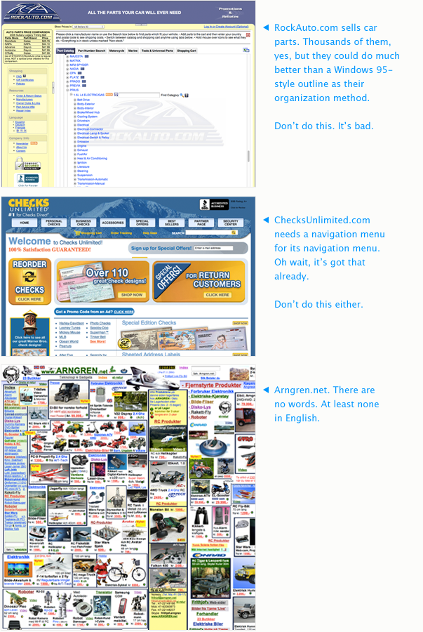
Search
If you know your products and your customers well, you should be able to design a search tool that will work really well for them.
If you know your products and your customers well, you should be able to design a search tool that will work really well for them.
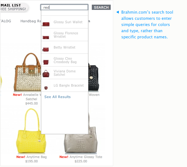
One of our clients, Litecontrol, sells a very specific product — lighting fixtures — to a very specific audience — contractors and distributors. Their customers are not typical consumers. They are highly educated and know the exact technical specifications they need. So in addition to general sorting options in the websites menu structure, like “Browse All Products,” “Browse New Products,” “Browse by Product Family,” etc., Litecontrol created a specific filtration tool that allows their users to sort the entire product catalog by the attributes that matter to them: mounting type, light distribution, lamping, etc. We don’t know what that stuff means, but we don’t have to. Only the people who would buy industrial lighting fixtures matter here, and Litecontrol is obviously very aware of that. But they’ve also included a simple search field that allows users to type in many of those filter attributes, as well as product names, and any other text, and retrieve results in real time. Because they knew their customers often already had the exact product number in mind, the search tool was built to enable them to drop that in and get only the matching product back. We call this super-search, but really, it’s just a smarter step up from a basic text search that most websites have. It looks at specific metadata to retrieve the best matches to the queries it receives.
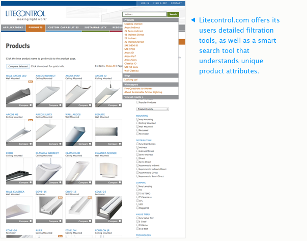
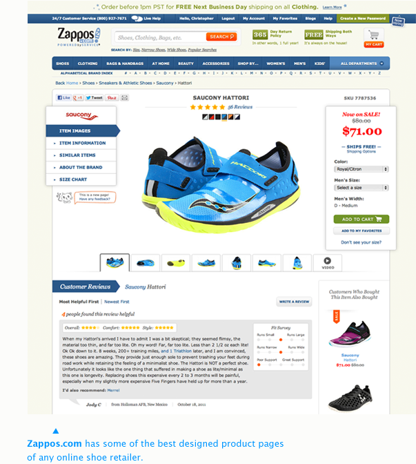
Another example of this can be found at Brahmin.com. While they’ve organized their product catalog — which is all leather handbags — into sortable categories and collections, the simplest way to navigate their site is to use their search tool. You don’t have to know the name of any of their bags, just what kind of bag you want. It’s been programmed to understand specific attributes, like color or bag style, so that if you begin to type “red” or “red tote,” the list it retrieves will be only those kinds of bags. Once you get that, you’re probably not going to spend much time navigating the old-fashioned way.
Product Detail Pages
You’ve shopped online enough to know exactly what a product detail page needs. And yet, many of them lack those very things or get them very wrong. Much of this stuff is really straightforward, so rather than explain it in great length, I’m going to list out the essential attributes of a product detail page in order of importance:
You’ve shopped online enough to know exactly what a product detail page needs. And yet, many of them lack those very things or get them very wrong. Much of this stuff is really straightforward, so rather than explain it in great length, I’m going to list out the essential attributes of a product detail page in order of importance:
- Product Name
Duh. But really, don’t make a customer guess what they’re looking at. Also, be specific. Large Athletic Fit Cotton Blend Grey T-Shirt is better than T-Shirtor even The Monterrey Shirt. Especially if your page doesn’t have… - Images
Originally, I had price next on my list, but the reality is that if a customer can’t see it, then a low price will scare them, not encourage them to buy it. Lots of images. The more the better. Also, zoomable. - Price
But please don’t make it look like a product is on sale if you always sell it at the sale price. People catch on to that sort of thing. - Buy Button
This is not a text link. It’s a big, clear button that has some sort of active state. As for colors, wording, and location, test them. - Description
If there’s no additional text on your product page, it’s not likely to show up in any shopper’s search results. You need to give Google something to work with, but it also needs to serve the customer. Include info that they’ll care about, like what makes it different from similar products you sell, especially if the images don’t make that clear. Once a user starts asking “Why is this one more than that one?” you’ve probably already lost them. - Other Details
Sizes, Materials, Pages, Length, Weight, Colors, etc. - Quantity
Let the user identify the number they want before they’re in the checkout process (but let them change it later, too). - Number Available
If you have limited stock of something, indicate that on the page. It’s a great motivator. If you have multiple points of sale, you’ll need a system that reconciles inventory and a way to integrate it with your website. - Delivery Information
If you know a product requires a particular amount of time to prepare for shipping, display that information (e.g. “Ships in 2 Weeks”). - Related Products
This is your opportunity to display accessories or similar products, but do it with restraint. A focused page for a smaller retailer is more likely to sell than an unfocused one. - Social Media
Give customers an ability to share your product and they probably will. Especially Facebook and Pinterest. I might reserve Twitter integration for those that complete a purchase — I doubt many people are as likely to Tweet something on the basis of window shopping as they would “like” it or “pin” it. But that’s just my opinion.
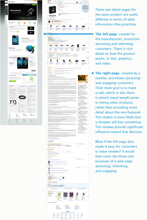
Let’s see how these attributes are handled by two stores offering the same product. Below are two pages displaying the Nike Fuel Band. On the left is the page created by Nike at Nike.com. On the right isAmazon’s page. By reducing the pages in size, we can focus on some of the key differences in the way the two stores prioritize information.
Nike is obviously very focused on attracting customers and informingthem about the Fuel Band. Their page is elegantly designed using lots of large, beautiful images and includes very clear instructions as to the product’s purpose and use. As you scroll down, the page deliberately tells the Fuel Band’s story, starting with what it does, then how it works, then how it integrates with other software and devices, and finally a very detailed listing of technical specifications, a sizing guide, and an FAQ.
It’s really quite well done, though it has two weaknesses. The first one is that there is one “BUY NOW” button on the page, located at the very top. It wouldn’t hurt to have an additional one somewhere lower on the page, or have the buy action follow the user — though some mind find that pushy. All things considered, this is a relatively minor point. The other weakness has to do with reviews. There are none. Once we compare this page with Amazon’s, we’ll see why that is a big problem.
Amazon’s page doesn’t do as good of a job of informing customers; there is far less information about the Fuel Band here than on Nike’s page. As for attracting, because this is Amazon — remember, a store with millions of shoppers milling around — they don’t have to do that with descriptive content. They just have to stock the product and someone will buy it. But if they did want to attract a new customer — someone shopping using Google, for example — their prioritization ofengagement will take care of that. All of those reviews are indexable, and they help Amazon sell.
Now, let’s see how that Google shopper might experience this. Below are two screenshots from searches I just made using Google without being signed in to my account (if you are not signed in, you can reproduce these searches, too).
First, I searched for “nike fuel band“. The results I received were dominated by Nike’s own website, which occupied the first three organic results. Amazon’s page came in fourth. Next, I searched for “nike fuel band review“. That search changed everything. Instead of Nike.com pages at the top, the first slot is now occupied by Amazon’s Fuel Band page, and the next four are occupied by other review websites.
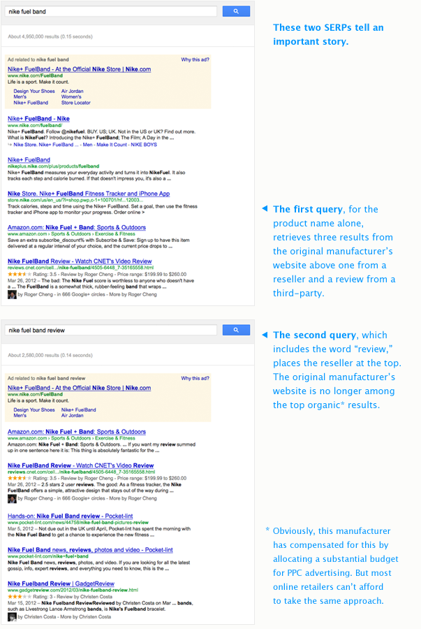
Now, obviously, Nike has dealt with this situation by allocating what is likely a very substantial budget toward PPC advertising, which keeps them in that top ad slot no matter what. But that’s not necessarily a slam-dunk. Plenty of people have developed a subconscious blindspot for the ad slots on Google. Additionally, without being able to see a product in person, most online shoppers make decisions based upon reviews. As soon as that word is added to the query, Amazon beats Nike at selling Nike’s product. The moral of the story: Nike.com should include reviews on the Fuel Band’s page.
But it gets worse. If you happen to click “BUY NOW” on the Nike page, you are taken to another product detail page on which you can see the price — Aha, the price wasn’t even listed on the other page, was it? — and choose your size and quantity. Oh, and low and behold, there are customer reviews there! Almost 400 of them! Yet, this page isn’t showing up in Google’s search results. Why isn’t Nike consolidating this page with the other one? You’ve got me.
So may this be a lesson unto you: Include all the necessary information on one page: Name, Images, Price, Details, Quantity, etc. Design it well. Make it shareable. Don’t rely upon PPC because you can’t afford to spend what Nike spends. Instead, leverage reviews. Presto!
Checkout
The shopping experience is obviously important, but so is the buyingexperience. Unfortunately, this is often where online stores fall apart, or at least default to generic settings that don’t always fit the product or customer well. Here are just a few things to consider as far as the checkout process is concerned:
The shopping experience is obviously important, but so is the buyingexperience. Unfortunately, this is often where online stores fall apart, or at least default to generic settings that don’t always fit the product or customer well. Here are just a few things to consider as far as the checkout process is concerned:
- Accounts
In preparation for this article, I asked people about what made e-commerce experiences good and not-so-good, and the most common answer I received had to do with the frustration they’ve experienced when an online store forces them to set up an account before they can check out. With generalist stores like Amazon, it makes a lot of sense to require customer accounts. The more often a customer returns to shop, the more important it will be to them to have the fastest checkout process possible. But with niche shops, where customers are less likely to make frequent and additional purchases, requiring an account is simply an obstacle. Account systems are often created so that customers can return to see previous orders and/or track packages, but if you can have the account setup happen as an optional part of the process, rather than interrupt it and require users to divert to a new account setup procedure where they will enter the same information they would have entered while checking out, that would be much better. - Cart Detail:
Provide as much detail about the contents of a customer’s cart as possible. This should include the name of the product (that links back to its detail page), an image, a brief description, the price, and quantity. - Order Adjustments
It’s always best to allow customers to adjust their orders — especially the quantity of items in their cart — during the checkout process. Giving them access to the quantity field and a button to “Refresh” or “Update Cart” is expected. - Progress Indicator:
If your checkout process is broken up into multiple steps, always display a visual indication of where the customer is currently. - Chat Support
The more customers your website has, the more likely that some of them are to become confused — no matter how good the design is. Often, that confusion leads to abandoned carts (though second-thoughts are also a major factor here, of course). One way that some online retailers handle this is to capture cutover email addresses as a first-step in the checkout process, so they can email them if they drop off before completing their purchase. This is not the ideal way to go. Instead, set up a live-chat tool that users can engage with if they run into trouble. You can also configure it to ask if the customer needs help if they are idle on the page after a set amount of time. That’s a whole lot better than chasing them out of the store, right? - Keep it as simple as possible!
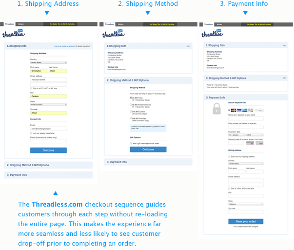
On that last note, I’d like to share a couple of examples. On more recently designed websites, I’m seeing a more consolidated approach to the checkout process. Rather than filling out a form, advancing to a new page, filling out a form there, and so on, these sites are finding ways to simplify the experience to minimize the amount of form fields and page loads from start to finish. In some cases, each step occurs without the checkout page re-loading at all. This is ideal; every time a new page has to load, you run the risk of losing your customer, either to an interruption in their connection, or to confusion or impatience.
One good example comes from Threadless.com, which consolidates the checkout process to three easy steps, each of which appear after clicking “Continue” without actually re-loading the page.
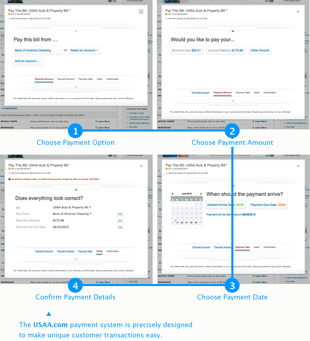
Another example comes from USAA.com. Because USAA is not a traditional retailer — they offer a variety types of financial transactions, like paying bills and account transfers — it has designed a “checkout” process that is finely tuned to the specific transaction you are completing. Each step takes a “speak human” approach to guiding the user. In the example below, I was quickly guided through paying my auto insurance bill, though the options I was given were many, including choosing from a list of possible payment sources, determining the amount I’d like to pay, the date I’d like to schedule my payment, and finally a review of all the details.
This is *just* the beginning…
If you made it this far, I applaud you!
Yes, there’s a lot here, but this article has really just scratched the surface. E-commerce design and development is an enormous subject — one that really requires even more information than I’ve just begun to collect here. Below I’ve listed a few resources to pick up where this has left off, but I’d love to add your suggestions to the list. Let me know of any other articles, books, or videos that you’ve found helpful in the comments below…


